As dusk descended upon the historic town of Frederick, the man set his trusty 1947 vintage Kodak Bantam atop his tripod facing a scene of increasing darkness along Carroll Creek and fired off his last shot of the roll of Kodachrome 828 film, experimenting with a setting of 10 secconds at f/11 and drew his photographic day to a close. The day had been a long one, starting off with delays and disruption from livestock on the B&O Railroad line linking Frederick with Washington, DC, but had managed to improve quite a bit, turning out to be an unseasonably warm Winter's day with vivid blue skies. Returning home, he unloaded the film from the Bantam and prepared to mail the parcel off to be developed in the hopes he had made the proper exposure calls through his sojourn of the day so as to get some rich color slides back from the 828 Kodachrome.
Reading the narrative above, one might think it depicts a time long passed in settings vastly different in appearance than they are today, but this in fact a condensed retelling of the events I experienced on January 25, 2017.
Yes, you read that title right. Like a phoenix rising from the ashes, it is possible to shoot Kodachrome again and get results in color!

Kodachrome film itself ceased production in 2009, and its unique K14 developing process called it quits when Dwayne's Photo Lab developed its last rolls of Kodachrome at the end of 2010. The result is that photographers who may have some Kodachrome on their hands were largely stuck to developing it in black and white chemistry and getting negatives which often displayed a somewhat odd tonality. It seemed as if any chance of getting color positives from Kodachrome was never going to occur again.
But even after the process was discontinued, a few people have managed to develop color slides from Kodachrome film successfully. Stephen Frizza briefly created a buzz among some enthusiasts when he showed that it was in fact possible to get color images from Kodachrome film, albeit using alternate methods with the likelihood of far less archival stability than the original process.
The latest enthusiast to engineer a way to generate color positives from Kodachrome film is Kelly-Shane Fuller of Piratelogy Studios. The Oregon based film photographer has devised a process that is cumbersome even by his own admission, but manages to create a positive transparency that incorporates dyes to mimic the color couplers that were part of the original K14 process. It's a very creative technique that is admittedly imperfect compared to the "official" process, but it is amazing nonetheless.
While Mr. Fuller had spotlighted this ability, he had to contemplate if he would make the process available as a public service for the Kodachrome nuts like myself who would still love to have the option of developing their Kodachrome film and have color images. On January 24, 2017, he made the announcement that he'd offer film developing of K14 based Kodachrome film for a reasonable price of $25 per roll plus shipping.
When I saw the post, "intrigued" did not begin to describe my enthusiasm, I promptly went onto ebay and ordered two rolls of nearly 20 year old Kodachrome 25 for a future feature, but I ached to get out as soon as I could to shoot a roll of honest, venerable Kodachrome and send it off. On returning home, I scoured my stocks to discover that I had two "collection" rolls of Kodachrome 25 of 1975 vintage among my inventory.... in 828 format at that!
The planets seemed to align almost magically, as this was the perfect opportunity for a test roll across the spectrum to see how well different colors rendered in this alternate process. The 828 roll would give me just enough exposures to shoot quickly and send right off To top it off, after a week of gloomy skies and rains, sun dominated the landscape in the mid-Atlantic as day dawned on January 25th. To paraphrase Paul Simon, on this day, no one was taking my Kodachrome away after all.

The actual camera for this endeavor was none other than my 1947 vintage Bantam 4.5 Special, my father's camera from his teenage years, and one on which he shot a number of rolls of Kodachrome. It seemed a fitting honor that my first chance to shoot color Kodachromes again happened to be on this wonderful camera. Under a blue sky and full sun, I shot off the first 7 exposures, and saved the last for an expected time exposure at dusk back in Frederick. Along as a companion was another similarly sleek camera in a discontinued format, the Minolta Vectis 300. On the Minolta, companion shots of most of the scenes were taken to provide a comparison between a C-41 rendering of the scenes with those taken on the Bantam, and processed in the alternative process to K14. With these images to compare side by side, I expected to be able to determine the type of scenes that will render the most colorfully, as well as what scenes might make for some interesting art.
Given the age of the film, it was shot roughly between ISO 8 and 10, which generally meant exposures of f/5.6 at 1/50 in full sun. It was more of an educated guess than anything scientific that went into the decision regarding the speed at which to shoot this film that had sat dormant for over 4 decades.
I scanned the Kodachrome film using a consumer grade Epson V550 scanner, The original film carried a strong magenta cast to the 42 year old Kodachrome stock to which only levels have been applied under the initial scan. I then did a second scan using the "Restore Colors" settings, adjusted curves to darken the image, and did some further refinements in Photoshop. These results shouldn't be interpreted as a "best possible result" but are intended to show some improvement in tones without pushing too far into an overly tweaked look, a balance that is somewhat tenuous given the age of the film and the fogging it encountered.
Scene 1: (APS film above, base Kodachrome scan middle, and "enhanced" Kodachrome scan at bottom) - I selected this scene as my first since it featured a rich blue sky, some earthy green in the backdrop, and a subject clad in metallic gold. The APS version pretty much rendered the scene as it was, while you'll noticed a strong magenta cast to the 42 year old Kodachrome film to which only levels have been applied. After using restoration settings in the scanning software and further tweaks in Photoshop, the Kodachrome image portrays more naturally, albeit with an olive cast, discoloration in the sky, and green elements of the scene with nearly no saturation levels. An interesting first start.


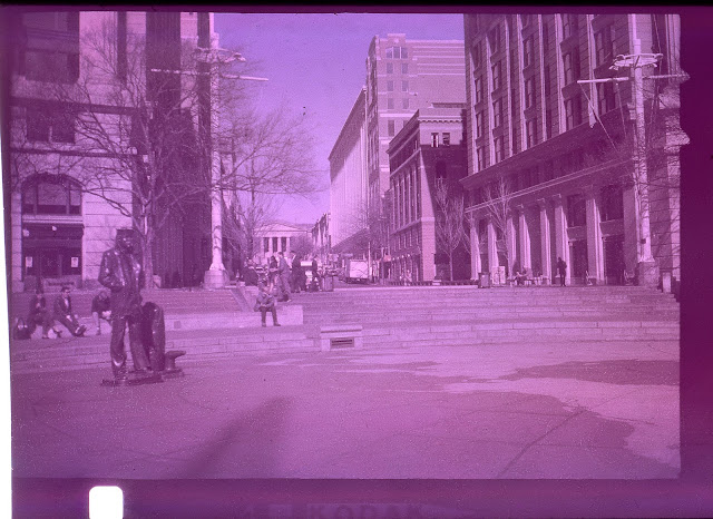
Scene 4: (APS film above, base Kodachrome scan middle, and "enhanced" Kodachrome scan at bottom) - a variety of "natural" tones of stone and brick are the most evident in the below scene. One of my favorites of the batch, the Kodachrome image gives off a very vintage feel, reminding me of the color palette given off by the very early 1938 Kodachrome in Weekly Feature #73. It seems this process is well suited for scenes of somewhat muted colors to begin with, set off by bright blue skies.


Scene 5: (APS film above, base Kodachrome scan middle, and "enhanced" Kodachrome scan at bottom) - Another look at red's potrayal is tackled below, as a bright red awning hovers over a brick sidewalk, while a different hue of red can be seen on the banner in the distance. The red is again muted, and seems to be the most vivid in the brick building on the left of the frame.


Scene 6: (APS film above, base Kodachrome scan middle, and "enhanced" Kodachrome scan at bottom) - My main reason for taking this photo was the desire to capture different shades of green. The street sign is more of a kelly green, while the distant covering and evergreen foliage offers more natural shades. However, it was evident that if there was one color these slides failed to convey, it was green. Both street sign and distant foliage are rendered in a nearly monochrome grey hue. That said, even the blue is a bit subdued on this example.


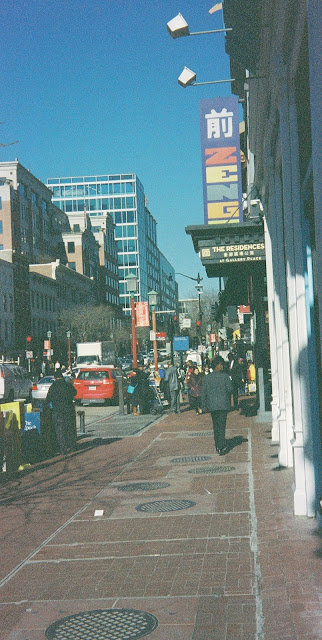
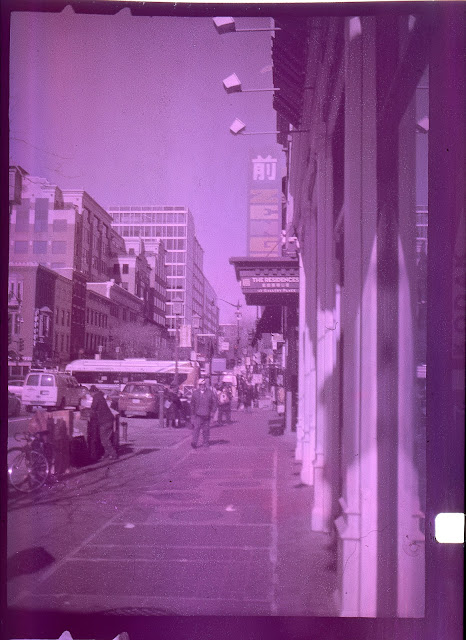
Scene 7: (APS film above, base Kodachrome scan middle, and "enhanced" Kodachrome scan at bottom) - The banner in this image allowed me to capture some less primary colors in my testing, and consisted of a deep purple backdrop, and letters in a pale red, pale yellow, pale green, tangerine orange, and sea green respectively. Some primary shades of red and blue are evident in the scene for comparison. I like this one for many of the same reasons as I like the results in scene #4, but this one manages to bring in a few more colors. Again, the sky is rendered nicely, while the warm cream hue in "The Residences" sign's lettering is very accurate. The already soft tones of the ZENGO sign are also fairly well represented in this image.

Scene 8: (APS film above, base Kodachrome scan middle, and "enhanced" Kodachrome scan at bottom) - As a fan of time exposures, I couldn't resist saving a dusk scene from Carroll Creek in Frederick as my last shot on this trial roll. Ok, first of all, I don't know how I botched the focus in the Bantam's last shot, though setting the aperture to f/11 and shooting bulb may have caused some issues. The scene didn't have a lot of variation in color to begin with, and the Kodachrome did capture the soft hues of this setting with some degree of accuracy.


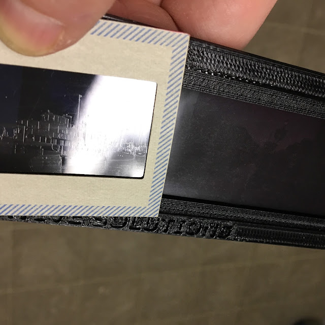
One other observation about the differences between the slides I received back, and those done with typical Kodachrome processing is that these lacked the "etched" look on the reverse side of the slide, a signature feature evident in any Kodachrome processed slide, whether from 1940 or 2000. If there was anything that certainly reinforced to me that this was a recreation of the K-14 process rather than a replication of the process, this would be it.
Reading the narrative above, one might think it depicts a time long passed in settings vastly different in appearance than they are today, but this in fact a condensed retelling of the events I experienced on January 25, 2017.
Yes, you read that title right. Like a phoenix rising from the ashes, it is possible to shoot Kodachrome again and get results in color!

Just what is this you are looking at? Read on! (Photo by Kelly-Shane Fuller)
Kodachrome film itself ceased production in 2009, and its unique K14 developing process called it quits when Dwayne's Photo Lab developed its last rolls of Kodachrome at the end of 2010. The result is that photographers who may have some Kodachrome on their hands were largely stuck to developing it in black and white chemistry and getting negatives which often displayed a somewhat odd tonality. It seemed as if any chance of getting color positives from Kodachrome was never going to occur again.
But even after the process was discontinued, a few people have managed to develop color slides from Kodachrome film successfully. Stephen Frizza briefly created a buzz among some enthusiasts when he showed that it was in fact possible to get color images from Kodachrome film, albeit using alternate methods with the likelihood of far less archival stability than the original process.
The latest enthusiast to engineer a way to generate color positives from Kodachrome film is Kelly-Shane Fuller of Piratelogy Studios. The Oregon based film photographer has devised a process that is cumbersome even by his own admission, but manages to create a positive transparency that incorporates dyes to mimic the color couplers that were part of the original K14 process. It's a very creative technique that is admittedly imperfect compared to the "official" process, but it is amazing nonetheless.
While Mr. Fuller had spotlighted this ability, he had to contemplate if he would make the process available as a public service for the Kodachrome nuts like myself who would still love to have the option of developing their Kodachrome film and have color images. On January 24, 2017, he made the announcement that he'd offer film developing of K14 based Kodachrome film for a reasonable price of $25 per roll plus shipping.
When I saw the post, "intrigued" did not begin to describe my enthusiasm, I promptly went onto ebay and ordered two rolls of nearly 20 year old Kodachrome 25 for a future feature, but I ached to get out as soon as I could to shoot a roll of honest, venerable Kodachrome and send it off. On returning home, I scoured my stocks to discover that I had two "collection" rolls of Kodachrome 25 of 1975 vintage among my inventory.... in 828 format at that!
The planets seemed to align almost magically, as this was the perfect opportunity for a test roll across the spectrum to see how well different colors rendered in this alternate process. The 828 roll would give me just enough exposures to shoot quickly and send right off To top it off, after a week of gloomy skies and rains, sun dominated the landscape in the mid-Atlantic as day dawned on January 25th. To paraphrase Paul Simon, on this day, no one was taking my Kodachrome away after all.

The actual camera for this endeavor was none other than my 1947 vintage Bantam 4.5 Special, my father's camera from his teenage years, and one on which he shot a number of rolls of Kodachrome. It seemed a fitting honor that my first chance to shoot color Kodachromes again happened to be on this wonderful camera. Under a blue sky and full sun, I shot off the first 7 exposures, and saved the last for an expected time exposure at dusk back in Frederick. Along as a companion was another similarly sleek camera in a discontinued format, the Minolta Vectis 300. On the Minolta, companion shots of most of the scenes were taken to provide a comparison between a C-41 rendering of the scenes with those taken on the Bantam, and processed in the alternative process to K14. With these images to compare side by side, I expected to be able to determine the type of scenes that will render the most colorfully, as well as what scenes might make for some interesting art.
Given the age of the film, it was shot roughly between ISO 8 and 10, which generally meant exposures of f/5.6 at 1/50 in full sun. It was more of an educated guess than anything scientific that went into the decision regarding the speed at which to shoot this film that had sat dormant for over 4 decades.
I scanned the Kodachrome film using a consumer grade Epson V550 scanner, The original film carried a strong magenta cast to the 42 year old Kodachrome stock to which only levels have been applied under the initial scan. I then did a second scan using the "Restore Colors" settings, adjusted curves to darken the image, and did some further refinements in Photoshop. These results shouldn't be interpreted as a "best possible result" but are intended to show some improvement in tones without pushing too far into an overly tweaked look, a balance that is somewhat tenuous given the age of the film and the fogging it encountered.
- - - - - - - - -
Scene 1: (APS film above, base Kodachrome scan middle, and "enhanced" Kodachrome scan at bottom) - I selected this scene as my first since it featured a rich blue sky, some earthy green in the backdrop, and a subject clad in metallic gold. The APS version pretty much rendered the scene as it was, while you'll noticed a strong magenta cast to the 42 year old Kodachrome film to which only levels have been applied. After using restoration settings in the scanning software and further tweaks in Photoshop, the Kodachrome image portrays more naturally, albeit with an olive cast, discoloration in the sky, and green elements of the scene with nearly no saturation levels. An interesting first start.


- - - - - - - - - --
Scene 2: (Base Kodachrome scan above, and "enhanced" Kodachrome scan at bottom) - Curious of how the one magenta flower in a bed of ivy would portray, I shot it only with the the Bantam. The result is among the most "artistic" of the batch, with the green ivy rendering in a more or less grey hue, and the flower depicted in a deep orange hue.


- - - - - - - - - - - - -
Scene 3: (APS film above, base Kodachrome scan middle, and "enhanced" Kodachrome scan at bottom) - If there was one color that Kodachrome was known for, it was red. So when I saw the red taxicab caught at the red light, I elected to snap a couple of quick photos from the middle of the street. The same blue sky dominates the scene, while food trucks in shades of yellow and orange also make an appearance in the scene. Once again, the blue renders lovely, and while the brick tones of red on the buildings in the distance render well, the vivid red hues give off a muted hue, as does the orange on the traffic cone and second food truck. The yellow again portrays well, albeit with a bit of a warm hue.


- - - - - - - - - - - -
Scene 4: (APS film above, base Kodachrome scan middle, and "enhanced" Kodachrome scan at bottom) - a variety of "natural" tones of stone and brick are the most evident in the below scene. One of my favorites of the batch, the Kodachrome image gives off a very vintage feel, reminding me of the color palette given off by the very early 1938 Kodachrome in Weekly Feature #73. It seems this process is well suited for scenes of somewhat muted colors to begin with, set off by bright blue skies.


- - - - - - - - - - - - -
Scene 5: (APS film above, base Kodachrome scan middle, and "enhanced" Kodachrome scan at bottom) - Another look at red's potrayal is tackled below, as a bright red awning hovers over a brick sidewalk, while a different hue of red can be seen on the banner in the distance. The red is again muted, and seems to be the most vivid in the brick building on the left of the frame.


- - - - - - - - - - -
Scene 6: (APS film above, base Kodachrome scan middle, and "enhanced" Kodachrome scan at bottom) - My main reason for taking this photo was the desire to capture different shades of green. The street sign is more of a kelly green, while the distant covering and evergreen foliage offers more natural shades. However, it was evident that if there was one color these slides failed to convey, it was green. Both street sign and distant foliage are rendered in a nearly monochrome grey hue. That said, even the blue is a bit subdued on this example.


- - - - - - - - - -
Scene 7: (APS film above, base Kodachrome scan middle, and "enhanced" Kodachrome scan at bottom) - The banner in this image allowed me to capture some less primary colors in my testing, and consisted of a deep purple backdrop, and letters in a pale red, pale yellow, pale green, tangerine orange, and sea green respectively. Some primary shades of red and blue are evident in the scene for comparison. I like this one for many of the same reasons as I like the results in scene #4, but this one manages to bring in a few more colors. Again, the sky is rendered nicely, while the warm cream hue in "The Residences" sign's lettering is very accurate. The already soft tones of the ZENGO sign are also fairly well represented in this image.


- - - - - - - - -
Scene 8: (APS film above, base Kodachrome scan middle, and "enhanced" Kodachrome scan at bottom) - As a fan of time exposures, I couldn't resist saving a dusk scene from Carroll Creek in Frederick as my last shot on this trial roll. Ok, first of all, I don't know how I botched the focus in the Bantam's last shot, though setting the aperture to f/11 and shooting bulb may have caused some issues. The scene didn't have a lot of variation in color to begin with, and the Kodachrome did capture the soft hues of this setting with some degree of accuracy.


- - - - - - - - -

Note the relief evident on the 1940 Kodachrome to the left, when held to the light a certain way. I was unable to detect similar relief in my experimental roll of Kodachrome recently developed.
In summary, you might think I am disappointed in the results from this batch, but I can assure you that I am not. I remain amazed at what Mr. Fuller has been able to achieve, really enjoyed this wonderful experiment, and look forward to supporting him in the near and distant future should he continue to provide this service. My next roll to him will be significantly less vintage than this classic roll of 828 Kodachrome.
More important to note is that Mr. Fuller is continuing to make revisions to this process to improve color accuracy, tonality, and contrast in the results, so as he continues to make strides in these areas, we can expect that results will improve. For now though, this is a major milestone in being able to produce positive images in color from Kodachrome film stock, and one that I am thrilled to know exists!


